Swiggy lets Dineout stand alone with new identity
Swiggy simplifies its dining-out platform to Dineout, with a lowercase 'd' logo, mint colour and Swiggy pin—while keeping the parent logo as a trust cue.
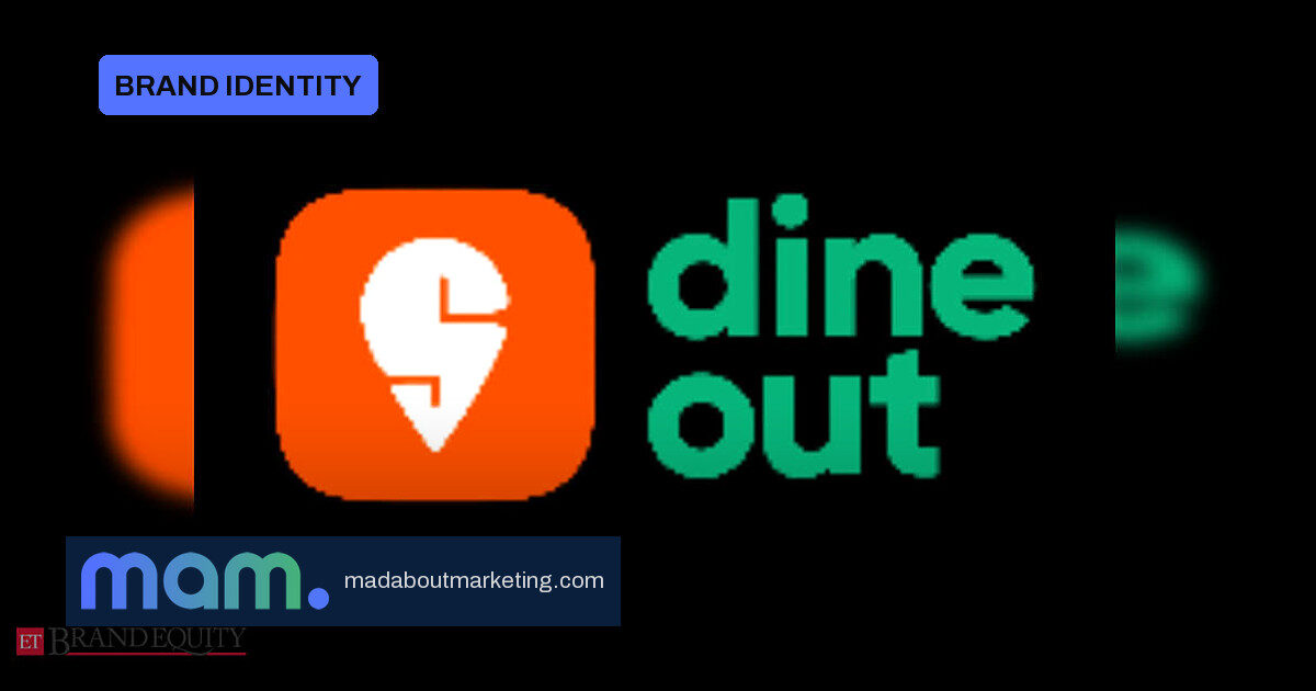
Swiggy is giving its dining-out platform room to build a brand of its own. The parent company has dropped the consumer-facing name Swiggy Dineout and will now present the platform simply as Dineout, even as the Swiggy logo remains part of the identity.
01 · What is changing
The refreshed identity centres on a compact lowercase ‘d’ mark, built for app icons, screens and other touchpoints, paired with a Swiggy pin. Fresh mint becomes the brand’s new colour theme, a shift from the earlier Swiggy-led presentation.
- Name: ‘Swiggy Dineout’ becomes ‘Dineout’ for consumers.
- Logo: A new lowercase ‘d’ mark, with the Swiggy pin retained.
- Colour: Fresh mint replaces the previous look.
- Rollout: Social media, customer communications and in-app messaging.
02 · Why Dineout is stepping out
The move is not a clean break. Mayur Hola, head of brand at Swiggy, describes Dineout as a big part of India’s dining and F&B ecosystem and says dropping the Swiggy prefix gives the brand ‘a more distinctive identity’. Keeping the Swiggy logo and pin is the important signal: the parent continues to lend credibility while the sub-brand builds its own recognition.
For CMOs, this is a live case study in brand architecture. Dineout is moving from being a clearly endorsed extension—where the parent name does much of the explaining—toward a standalone identity with a quiet endorsement cue. That is the stage many scale-ups eventually reach: the sub-brand has enough awareness to carry its own name, and the parent’s prefix becomes an unnecessary constraint rather than a trust shortcut.
03 · What the identity change signals
A distinctive name and colour are not cosmetic. In India’s crowded dining-out category, platforms compete for app-icon recognition, habitual use and top-of-mind recall. A compact lowercase ‘d’ and mint palette give Dineout its own visual memory hooks, while the Swiggy pin preserves the trust users already have.
The decision to roll the new identity across external channels at once—social, customer communications and in-app—is also worth noting. A rebrand that appears inconsistently can confuse the very users it is meant to reassure. This approach makes the change visible and coherent.
04 · What brand teams can take away
The lesson for marketers considering a similar move: when a sub-brand has reached meaningful awareness, the parent name can be retired from the consumer-facing identity without cutting the endorsement entirely. The parent’s logo, colour cue or symbol can remain as a quiet guarantee while the sub-brand invests in its own name, mark and palette.
Dineout’s repositioning will be tested by how quickly users adopt the standalone name and whether the platform gains perceived distinctiveness in dining out. For now, Swiggy is signalling that Dineout is not merely a feature—it is a brand.
Source: ETBrandEquity.com