How Axis Bank turned ‘open ki aadat’ into a creator habit
Creators across Food, Tech, Fashion and Lifestyle were interrupted by the same mysterious notification, then revealed the Axis Bank app behind it.
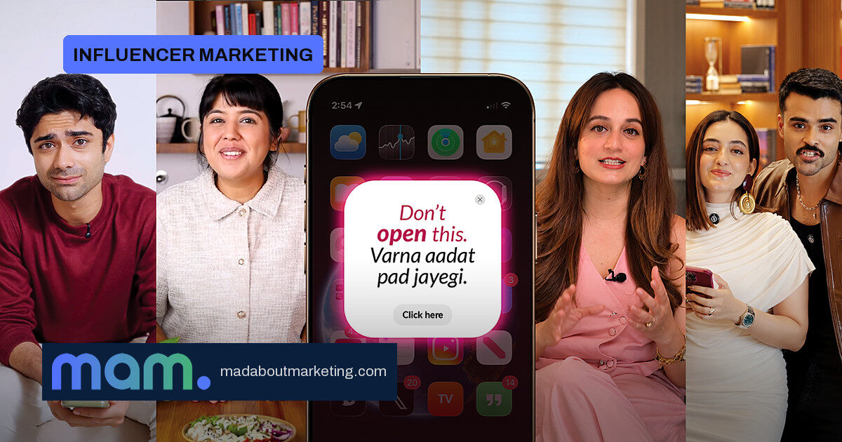
A cryptic notification interrupted creators mid-reel in Food, Tech, Fashion and Lifestyle feeds, all carrying the same line: “Don’t open this. Varna aadat pad jayegi.” No brand, no logo, no explanation. None of the creators opened it on camera, and none named the sender.
A few days later, they came clean. They had opened it — and the warning had already come true. The notification was from the open app by Axis Bank, and its secure, convenient features were quietly becoming a daily habit. That reveal marked the real start of ‘open ki aadat’, the bank’s new campaign for its mobile banking app.
01 · The campaign travelled creator by creator
After the reveal, more creators across different categories picked up the same aadat. Each video was built around a real everyday problem and the open feature that solved it:
- One-View — seeing all bank accounts in one place
- My Spends — making sense of the month’s expenses
- Control Centre — setting card controls from the app
Different creators, different niches, one aadat. The idea travelled from one feed to the next, and each creator eventually landed on the same question that anchors the campaign: “If my bank can do this, then why can’t your service?”
02 · Why a two-phase reveal works
For brand and marketing teams, the mechanics deserve attention. The campaign deliberately withheld both the brand and the product through the first phase. That does two jobs at once: curiosity carries the first wave of attention, and the later reveal feels like proof of the warning rather than a scripted pitch.
The anchor question is the strategic payload. When it comes from many creators across niches, it stops sounding like a campaign message and starts sounding like a peer expectation — precisely the register a habit-driven banking pitch wants to live in. The word aadat also does quiet work: it is an everyday Hindi word that pulls banking down from formal, high-stakes language into ordinary daily behavior.
For CMOs watching India’s crowded banking app space, the takeaway is less about the feature list and more about the order of events. Features such as One-View and My Spends are not new in isolation; what is new is selling the habit of using them, and letting creators demonstrate adoption before the brand claims it. The risk to watch is equally clear: a delayed reveal only pays off if the reveal lands strongly enough to justify the wait. Here, the shared anchor question gives the reveal its payoff.
03 · What marketers can borrow tomorrow
The most reusable piece is the sequence: a cryptic, unbranded prompt first, a brand and feature reveal second, and a shared anchor question that every creator repeats. If you brief creators, brief them on real problems they solve with your product and keep one line common — not a full script.
Beneath the mechanics sits the campaign’s central idea: when banking becomes simple, useful and intuitive, it naturally becomes part of everyday life. That is a positioning statement as much as a tagline, and it reframes the app battle from feature comparison to habit formation — which is far harder for a rival to copy.
Source: Afaqs!