TEAL rebrands after serving more than 150 clients
TEAL's new logo pairs a cobot-inspired symbol with a Tata-aligned wordmark as it targets precision manufacturing across global markets.
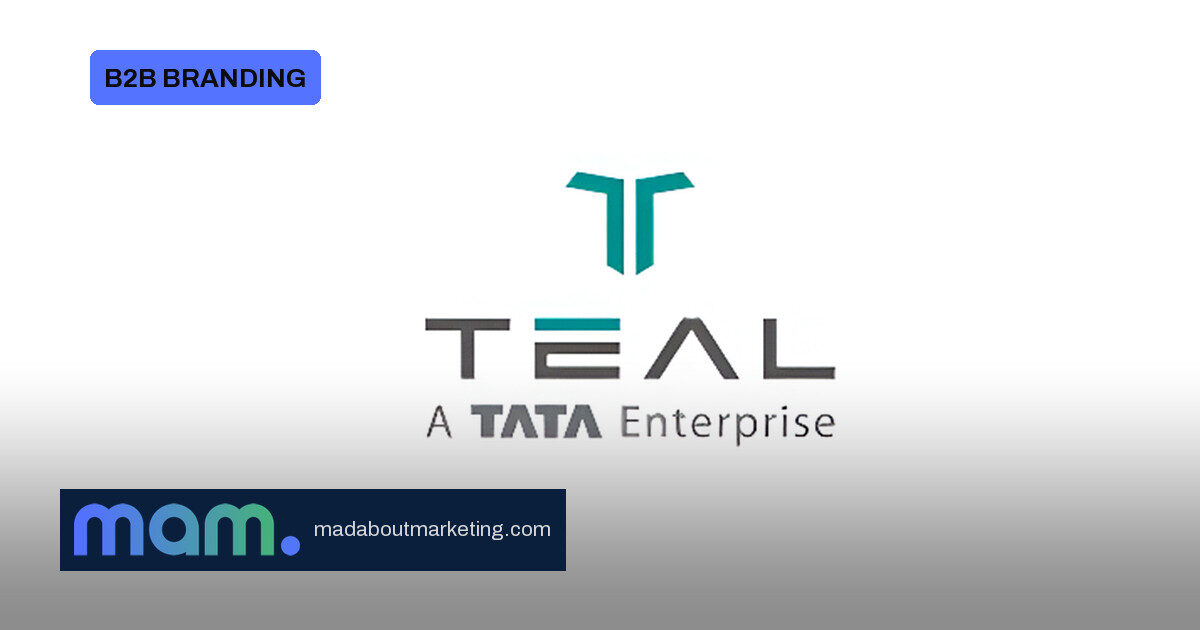
Titan Engineering and Automation Limited (TEAL) has stepped out with a new brand identity and logo, built to carry a precision-engineering and automation specialist into a wider global arena. The Hosur-headquartered company is not just refreshing a mark; it is aligning the visual system with an explicit ambition to engineer high-performance manufacturing from India for the world.
01 · What changed
The new identity works through two elements: a geometric symbol and a distinctive wordmark. The symbol is inspired by two collaborative robots working together, a cue to collaboration, precision and the synergy of automation. It also borrows from precision tooling and the clean, geometric design language associated with the Tata brand, giving TEAL a distinct but familiar identity.
The wordmark “TEAL” pays homage to the precision craftsmanship of its parent, Titan. The design is intentionally minimalist, with stability and reliability in the logo and a sense of clarity, simplicity and ingenuity in the engineering story. The accented ‘E’ and the Tata-inspired ‘A’ are meant to signal a progressive mindset and an ambition to push boundaries.
02 · Why the rebrand matters
TEAL began as Titan’s in-house precision engineering arm for watch manufacturing. It now supplies high-precision components and sub-assemblies to aerospace and defence, and builds complex turnkey assembly and testing lines for automotive, energy, electronics, life sciences and consumer goods. The identity has to hold all of that together without looking like a watchmaking legacy.
Sridhar NP, Managing Director and Chief Executive Officer of TEAL, described the new identity as a “modern, ambitious, and future-ready TEAL.” He linked the rebrand to India’s rapid manufacturing expansion and its emergence as a preferred global destination for industrial growth, while saying the company remains true to the TATA values that have earned customer and partner trust.
03 · The B2B branding lesson
For CMOs in industrial sectors, the TEAL refresh is a useful proof point in how to make a rebrand carry commercial intent. The new mark doesn’t merely look different; it is built to tell buyers and partners what the company does and where it wants to play.
- The symbol encodes the product promise: collaborative robots and precision tooling, not abstract swooshes.
- The wordmark borrows trust from Titan and Tata, so credibility is reinforced rather than built from scratch.
- The identity is pointed at external growth, not just internal pride: more than 150 clients across over 19 countries.
04 · What to watch
A rebrand succeeds only when the same story shows up across every touchpoint. For TEAL, that means the geometric symbol and wordmark need to feel consistent across aerospace and defence components, turnkey assembly lines and the many sectors it serves. The company says the new identity reinforces its focus on innovation, operational excellence and growth, but the real test will be whether global manufacturing customers read it as more modern, stable and reliable.
The timing is deliberate. India is making a push to be a preferred global destination for industrial growth, and TEAL has the credentials to justify a more outward-facing story: aerospace and defence components, turnkey assembly lines and a customer footprint that already spans over 19 countries. The new identity gives that story a sharper visual language.
Source: MediaNews4U